Showing posts with label Android Beginner. Show all posts

Sunday 18 August 2013

Android application for speech(voice) recognition

// siddhu vydyabhushana // 2 comments
The Android platform provides support for both speech recognition and speech synthesis. In this tutorial, we will create a simple Android app which allows the user to speak, attempts to recognize what they say, and then repeats what was recognized back to them using the Text To Speech engine.

Step 1: Start an Android Project

Create a new Android project in Eclipse. Alternatively, if you want to implement the speech recognition functionality in an existing app, open it instead. For this tutorial we have a minimum SDK version of 8, and you do not need to make any particular additions to your Manifest file, the default contents should suffice.

Step 2: Define the User Interface

Let’s start by defining the user interface. When the app launches, the user will be presented with a button. On pressing the button, the app will prompt them to speak, listening for their voice input. When the speech recognition utility processes the speech input, the app will present a list of suggested words to the user. As you’ll know if you’ve tried speech recognition as a user, the recognizer is not always accurate, so this list is essential. When the user selects an item from the list, the app will speak it back to them using the TTS engine. The TTS part of the application is optional, so you can omit it if you prefer.
The app is going to use a few text Strings as part of the interface, so define them by opening the “res/values/strings.xml” file and entering the following content:
1
2
3
4
5
6
<resources>
    <string name="intro">Press the button to speak!</string>
    <string name="app_name">SpeechRepeat</string>
    <string name="speech">Speak now!</string>
    <string name="word_intro">Suggested words&#8230;</string>
</resources>
Of course, you can alter the String content in any way you like.
Open your “res/layout/main.xml” file to create the main app layout. Switch to the XML editor if the graphical editor is displayed by default. Enter a Linear Layout as the main layout for the app’s launch Activity:
1
2
3
4
5
6
7
<LinearLayout xmlns:android="http://schemas.android.com/apk/res/android"
    android:layout_width="fill_parent"
    android:layout_height="fill_parent"
    android:orientation="vertical"
    android:background="#ff330066"
    android:paddingBottom="5dp" >
</LinearLayout>
The Linear Layout contains various style declarations including a background color. Inside the Linear Layout, first enter an informative Text View:
1
2
3
4
5
6
7
8
<TextView android:layout_width="fill_parent"
    android:layout_height="wrap_content"
    android:text="@string/intro"
    android:padding="5dp"
    android:textStyle="bold"
    android:textSize="16dp"
    android:gravity="center"
    android:textColor="#ffffff33" />
Notice that the Text View refers to one of the Strings we defined. It also sets various display properties which you can alter if you wish. After the Text View, add a button:
1
2
3
4
<Button android:id="@+id/speech_btn"
    android:layout_width="match_parent"
    android:layout_height="wrap_content"
    android:text="@string/speech" />
The user will press this button in order to speak. We give the button an ID so that we can identify it in the Java code and display one of the Strings we defined on it. After the button, add another informative Text View, which will precede the list of suggested words:
1
2
3
4
5
<TextView android:layout_width="fill_parent"
    android:layout_height="wrap_content"
    android:padding="5dp"
    android:text="@string/word_intro"
    android:textStyle="italic" />
Again, this Text View uses a String resource and contains style properties. The last item in our main.xml Linear Layout is the list of suggested words:
1
2
3
4
5
6
7
8
9
10
11
12
13
<ListView android:id="@+id/word_list"
    android:layout_width="fill_parent"
    android:layout_height="0dip"
    android:layout_weight="1"
    android:paddingLeft="10dp"
    android:paddingTop="3dp"
    android:paddingRight="10dp"
    android:paddingBottom="3dp"
    android:layout_marginLeft="20dp"
    android:layout_marginRight="20dp"
    android:layout_marginTop="5dp"
    android:layout_marginBottom="5dp"
    android:background="@drawable/words_bg" />
The List View will be populated with data when the app runs, so we give it an ID for identification in Java. The element also refers to a drawable resource, which you should add to each of the drawables folders in your app’s “res” directory, saving it as “words_bg.xml” and entering the following content:
1
2
3
4
5
6
7
8
9
10
11
12
    android:dither="true">
    <gradient
    android:startColor="#ff000000"
    android:endColor="#ff000000"
    android:centerColor="#00000000"
    android:angle="180" />
    <corners android:radius="10dp" />
    <stroke
    android:width="2dp"
    android:color="#66ffffff" />
</shape>
This is a simple shape drawable to display behind the List View. You can of course alter this and the List View style properties if you wish. The only remaining user interface item we need to define now is the layout for a single item within the list, each of which will display a word suggestion. Create a new file in “res/layout” named “word.xml”and then enter the following code:
1
2
3
4
5
6
7
8
    android:layout_width="fill_parent"
    android:layout_height="fill_parent"
    android:gravity="center"
    android:padding="5dp"
    android:textColor="#ffffffff"
    android:textSize="16dp" >
</TextView>
Each item in the list will be a simple Text View. That’s our interface design complete. This is how the app appears on initial launch:
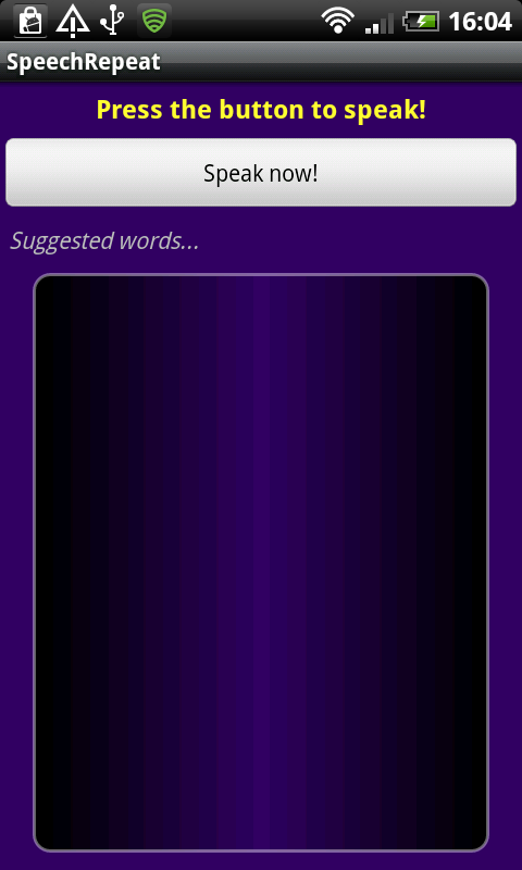
Speak and Repeat Launch
Note: don’t worry about the lack of dithering, this is just how it looks in the DDMS screenshot. On the device itself, the gradient is perfectly smooth.

Step 3: Setup Speech Recognition

Now we can implement our Java code. Open your app’s main Activity and add the following import statements at the top:
1
2
3
4
5
6
7
8
9
10
11
12
13
14
15
16
17
18
19
20
21
import java.util.ArrayList;
import java.util.List;
import java.util.Locale;
import android.app.Activity;
import android.content.Intent;
import android.content.pm.PackageManager;
import android.content.pm.ResolveInfo;
import android.os.Bundle;
import android.speech.RecognizerIntent;
import android.speech.tts.TextToSpeech.OnInitListener;
import android.speech.tts.TextToSpeech;
import android.util.Log;
import android.view.View;
import android.view.View.OnClickListener;
import android.widget.AdapterView;
import android.widget.AdapterView.OnItemClickListener;
import android.widget.ArrayAdapter;
import android.widget.Button;
import android.widget.ListView;
import android.widget.Toast;
import android.widget.TextView;
You may not need all of these if you do not implement the TTS functionality – Eclipse should highlight imports you have not used so check them when you finish coding. Extend your opening class declaration line as follows, altering the Activity name to suit your own:
1
public class SpeechRepeatActivity extends Activity implements OnClickListener, OnInitListener {
The “OnInitListener” is only required for the TTS function. Add the following instance variables inside your class declaration, before the “onCreate” method:
1
2
3
4
5
6
7
8
9
10
11
12
//voice recognition and general variables
//variable for checking Voice Recognition support on user device
private static final int VR_REQUEST = 999;
//ListView for displaying suggested words
private ListView wordList;
//Log tag for output information
private final String LOG_TAG = "SpeechRepeatActivity";//***enter your own tag here***
//TTS variables
//variable for checking TTS engine data on user device
private int MY_DATA_CHECK_CODE = 0;
//Text To Speech instance
private TextToSpeech repeatTTS;
Inside your “onCreate” method, your class should already be calling the superclass method and setting your main layout. If not, it should begin like this:
1
2
3
4
//call superclass
super.onCreate(savedInstanceState);
//set content view
setContentView(R.layout.main);
Next, still inside your “onCreate” method, retrieve a reference to the speech button and list we created, using their ID values:
1
2
3
4
//gain reference to speak button
Button speechBtn = (Button) findViewById(R.id.speech_btn);
//gain reference to word list
wordList = (ListView) findViewById(R.id.word_list);
The List View is an instance variable, accessible throughout the class. Now we need to find out whether the user device has speech recognition support:
1
2
3
4
5
6
7
8
9
10
11
12
13
//find out whether speech recognition is supported
PackageManager packManager = getPackageManager();
List<ResolveInfo> intActivities = packManager.queryIntentActivities(new Intent(RecognizerIntent.ACTION_RECOGNIZE_SPEECH), 0);
if (intActivities.size() != 0) {
    //speech recognition is supported - detect user button clicks
    speechBtn.setOnClickListener(this);
}
else
{
    //speech recognition not supported, disable button and output message
    speechBtn.setEnabled(false);
    Toast.makeText(this, "Oops - Speech recognition not supported!", Toast.LENGTH_LONG).show();
}
We query the environment to see if the Recognizer Intent is present. If it is, we instruct the app to listen for the user pressing the speech button. If speech recognition is not supported, we simply disable the button and output an informative message to the user.

Step 4: Listen for Speech Input

Let’s setup the click listener for the speech button we’ve instructed the app to detect clicks for. Outside the “onCreate” method, but inside your Activity class declaration, add an “onClick” method as follows:
1
2
3
4
5
6
7
8
9
/**
 * Called when the user presses the speak button
 */
public void onClick(View v) {
    if (v.getId() == R.id.speech_btn) {
        //listen for results
        listenToSpeech();
    }
}
Now implement the method we’ve called here after the “onClick” method:
1
2
3
4
5
6
7
8
9
10
11
12
13
14
15
16
17
/**
 * Instruct the app to listen for user speech input
 */
private void listenToSpeech() {
    //start the speech recognition intent passing required data
    Intent listenIntent = new Intent(RecognizerIntent.ACTION_RECOGNIZE_SPEECH);
    //indicate package
    listenIntent.putExtra(RecognizerIntent.EXTRA_CALLING_PACKAGE, getClass().getPackage().getName());
    //message to display while listening
    listenIntent.putExtra(RecognizerIntent.EXTRA_PROMPT, "Say a word!");
    //set speech model
    listenIntent.putExtra(RecognizerIntent.EXTRA_LANGUAGE_MODEL, RecognizerIntent.LANGUAGE_MODEL_FREE_FORM);
    //specify number of results to retrieve
    listenIntent.putExtra(RecognizerIntent.EXTRA_MAX_RESULTS, 10);
    //start listening
    startActivityForResult(listenIntent, VR_REQUEST);
}
Some of this code is standard for setting up the speech recognition listening functionality. Areas to pay particular attention to include the line in which we specify the “EXTRA_PROMPT” – you can alter this to include text you want to appear for prompting the user to speak. Also notice the “EXTRA_MAX_RESULTS” line, in which we specify how many suggestions we want the recognizer to return when the user speaks. Since we are calling the “startActivityForResult” method, we will handle the recognizer results in the “onActivityResult” method.
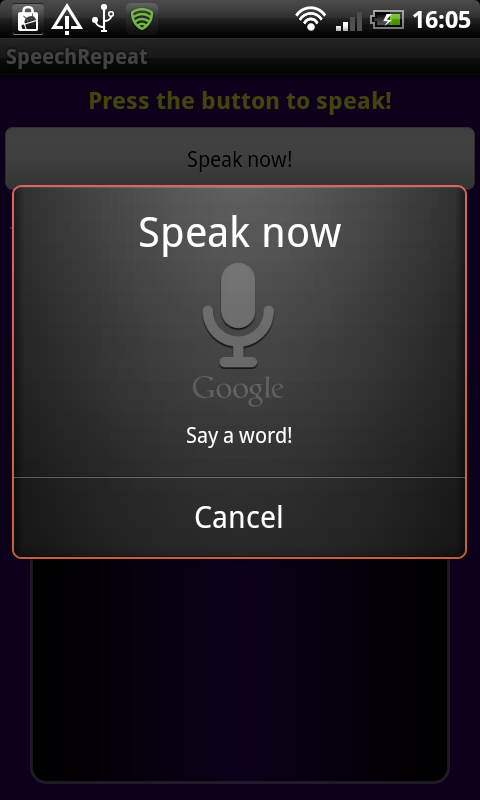
When the app is listening for user speech, it will appear as follows:
Speak and Repeat Listening

Step 5: Present Word Suggestions

Implement the “onActivityResult” method inside your class declaration as follows:
1
2
3
4
5
6
7
8
9
10
11
12
13
14
15
16
17
18
19
/**
 * onActivityResults handles:
 *  - retrieving results of speech recognition listening
 *  - retrieving result of TTS data check
 */
@Override
protected void onActivityResult(int requestCode, int resultCode, Intent data) {
    //check speech recognition result
    if (requestCode == VR_REQUEST && resultCode == RESULT_OK)
    {
        //store the returned word list as an ArrayList
        ArrayList<String> suggestedWords = data.getStringArrayListExtra(RecognizerIntent.EXTRA_RESULTS);
        //set the retrieved list to display in the ListView using an ArrayAdapter
        wordList.setAdapter(new ArrayAdapter<String> (this, R.layout.word, suggestedWords));
    }
    //tss code here
    //call superclass method
    super.onActivityResult(requestCode, resultCode, data);
}
Here we retrieve the result of the speech recognition process. Notice that the “if” statement checks to see if the request code is the variable we passed when calling “startActivityForResult”, in which case we know this method is being called as a result of the listening Intent. The recognizer returns the list of 10 suggested words, which we store as an Array List. We then populate the List View with these words, by setting an Array Adapter object as Adapter for the View. Now each of the items in the List View will display one of the suggested words.
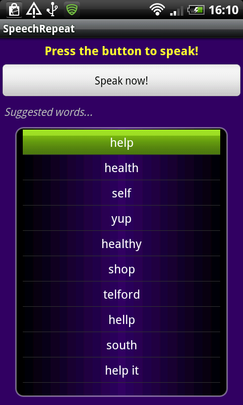
If the app successfully recognizes the user input speech and returns the list of words, it will appear as follows:
Speak and Repeat Word List
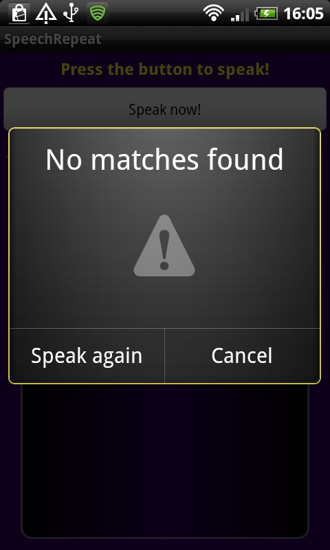
Alternatively, if the app does not recognize the user speech input, the following screen will appear:
Speak and Repeat Failed to Recognize

Step 6: Detect User Word Choices

We want to detect the user selecting words from the list, so let’s implement a click listener for the list items. Back in your “onCreate” method, after the existing code, set the listener for each item in the list as follows:
1
2
3
4
5
6
7
8
9
10
11
12
13
14
15
//detect user clicks of suggested words
wordList.setOnItemClickListener(new OnItemClickListener() {
    //click listener for items within list
    public void onItemClick(AdapterView<?> parent, View view, int position, long id)
    {
        //cast the view
        TextView wordView = (TextView)view;
        //retrieve the chosen word
        String wordChosen = (String) wordView.getText();
        //output for debugging
        Log.v(LOG_TAG, "chosen: "+wordChosen);
        //output Toast message
        Toast.makeText(SpeechRepeatActivity.this, "You said: "+wordChosen, Toast.LENGTH_SHORT).show();//**alter for your Activity name***
    }
});
We use the “setOnItemClickListener” method to assign a listener to each item in the list. Inside the new “OnItemClickListener”, we implement the “onItemClick” method to respond to these clicks – this method will fire when the user selects a suggested word from the list. First, we cast the View that has been clicked to a Text View, then we retrieve the text from it. This text is the word the user has selected. We write the chosen word out to the Log for testing and output it back to the user as a Toast message. Depending on the needs of your own application, you may wish to carry out further processing on the chosen word – this code is purely for demonstration.
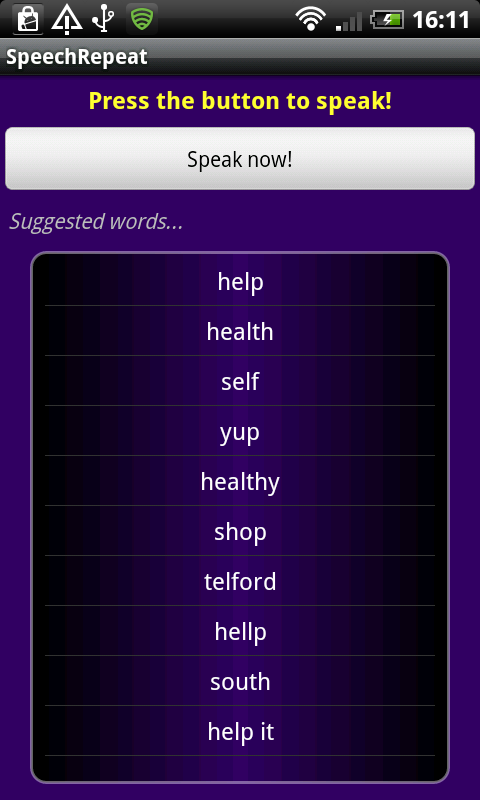
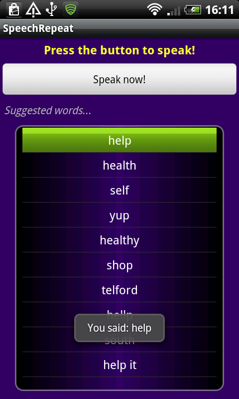
The user can press the touchscreen or use a trackball to select words in the list.
Speak and Repeat Selecting Words
When the user selects a word, the Toast message appears confirming it.
Speak and Repeat Toast Message

Step 7: Setup TTS Functionality

If you do not want to implement the Text To Speech functionality, you can stop now and test your app. We only require a little more processing to make our app repeat the user’s chosen word. First, to set up the TTS engine, add the following code to the section in your “onCreate” method where you queried the system for speech recognition support. Inside the “if” statement, after “speechBtn.setOnClickListener(this);”:
1
2
3
4
5
6
//prepare the TTS to repeat chosen words
Intent checkTTSIntent = new Intent();
//check TTS data
checkTTSIntent.setAction(TextToSpeech.Engine.ACTION_CHECK_TTS_DATA);
//start the checking Intent - will retrieve result in onActivityResult
startActivityForResult(checkTTSIntent, MY_DATA_CHECK_CODE);
Like the speech listening process, we will receive the result of this code checking for TTS data in the “onActivityResult” method. In that method, before the line in which we call the superclass “onActivityResult” method, add the following:
1
2
3
4
5
6
7
8
9
10
11
12
13
14
15
//returned from TTS data check
if (requestCode == MY_DATA_CHECK_CODE)
{
    //we have the data - create a TTS instance
    if (resultCode == TextToSpeech.Engine.CHECK_VOICE_DATA_PASS)
        repeatTTS = new TextToSpeech(this, this);
    //data not installed, prompt the user to install it
    else
    {
        //intent will take user to TTS download page in Google Play
        Intent installTTSIntent = new Intent();
        installTTSIntent.setAction(TextToSpeech.Engine.ACTION_INSTALL_TTS_DATA);
        startActivity(installTTSIntent);
    }
}
Here we initialize the TTS if the data is already installed, otherwise we prompt the user to install it. For additional guidance on using the TTS engine, see the Android SDK: Using the Text to Speech Engine tutorial.
To complete TTS setup, add the “onInit” method to your class declaration, handling initialization of the TTS as follows:
1
2
3
4
5
6
7
8
/**
 * onInit fires when TTS initializes
 */
public void onInit(int initStatus) {
    //if successful, set locale
    if (initStatus == TextToSpeech.SUCCESS)
        repeatTTS.setLanguage(Locale.UK);//***choose your own locale here***
}
Here we simply set the Locale for the TTS, but you can carry out other setup tasks if you like.

Step 8: Repeat the User Choice

Finally, we can repeat the user’s chosen word. Back in your “onCreate” method, inside the “OnItemClickListener” “onItemClick” method, after the line in which we output a Toast message, add the following:
1
2
//speak the word using the TTS
repeatTTS.speak("You said: "+wordChosen, TextToSpeech.QUEUE_FLUSH, null);
This will cause the app to repeat the user’s chosen word as part of a simple phrase. This will occur at the same time the Toast message appears.

Conclusion

That’s our complete Speak and Repeat app. Test it on an Android device with speech recognition and TTS support – the emulator does not support speech recognition so you need to test this functionality on an actual device. The source code is attached, so you can check if you have everything in the right place. Of course, your own apps may implement speech recognition as part of other processing, but this tutorial should have equipped you with the essentials of supporting speech input.
Read More

Friday 16 August 2013

Top-5 Android Beginner tutorials by javatyro

// siddhu vydyabhushana // 2 comments
popular , simple and easy android top-5 beginner tutorials

http://javatyro.blogspot.in/2013/08/android-beginner-basic-layouts-in.html

http://javatyro.blogspot.in/2013/08/android-beginner-basic-text-controls.html

http://javatyro.blogspot.in/2013/08/android-beginner-basic-buttons-design.html

http://javatyro.blogspot.in/2013/08/android-beginner-getting-stated-with.html

http://javatyro.blogspot.in/2013/07/android-simple-calculator-application_26.html
Read More

Thursday 15 August 2013

Android bEGINNER : Basic text controls

// siddhu vydyabhushana // 3 comments
In this tutorial, you’ll learn how to create basic Android text controls. Then you’ll learn how to configure, style, and manipulate the controls in a variety of ways.

This tutorial shows you the steps to create a number of different TextView controls in your Android application. First, you learn how to add basic text controls to your layout files and what some of their most useful attributes are. Next, you learn how to set the text control’s contents in two different ways. Finally, we discuss some of the other features available to TextView control in Android.
The Android SDK includes a simple static text control for use within your layouts: TextView (android.widget.TextView). A good example of TextView control usage would be to display textual labels for other controls, like “Enter a Date:”, “Enter a Name:” or “Enter a Password:”.
Here is an example of a screen with many different TextView controls displayed on it.
Android screen with numerous TextView controls

Step 1: Create an Android Application

Begin by creating an Android project. Implement your Android application as normal. Once you have a project set up and the application running, decide under what screen you want to add text controls to. Perhaps you’ve simply created a new Android project with its default Activity and layout (main.xml). This will work for this exercise. Once you have gotten your Android project set up, you are ready to proceed with this tutorial.

Step 2: Adding a TextView Control to a Layout

TextView controls are usually included as part of your Activity’s layout resource file. For example, to add a TextView control to the main.xml layout resource associated with your application, you must edit the layout file. You can do this within Eclipse using the Layout Resource designer, or by editing the XML directly. Controls can also be created programmatically and added to your screen at runtime. Simply create a Textview control (android.widget.TextView) and add it to your layout within your Activity.
To add a TextView control to a layout resource file, open the /res/layout/main.xml layout file that is part of your Android project. Click on the LinearLayout (or parent layout control) that you wish to add the TextView control to. In Eclipse from within the graphical Layout Resource designer, you can select the TextView control and drag it into the parent layout.
To configure how the TextView control looks and behaves, adjust the control’s attributes by selecting the control (either in the Outline tab or the Preview window) and changing its attributes, as shown the Properties Tab. You can also edit the XML directly.
Specific attributes of TextView controls you will want to be aware of:
  • Give the TextView control a unique name using the id property.
  • Set the text displayed within the TextView control using the text property; programmatically set with the setText() method.
  • Set the layout height and layout width properties of the control as appropriate.
  • Set any other attributes you desire to adjust the control’s appearance. For example, adjust the text size, color, font or other style settings.
Let’s discuss some of the most common attributes for TextView controls.

Step 3: Aligning Text within a TextView Control

By default, text contents of a TextView control are left-aligned. However, you can position the text using the gravity attribute. This setting positions your text relative to the control’s overall width and height and only really makes sense to use if there is whitespace within the TextView control because you’ve set it’s layout_height and/or layout_width to something other than wrap_content. In XML, this property would appear within your TextView control as:
android:gravity="center"
You can see an example of a center-aligned TextView control in the figure above, referred to as “Centered Text”. This TextView control has a layout_width of match_parent and a layout_height of wrap_content.
If you’re working with TextView control’s in your Java code, you can also set the alignment of your TextView control programmatically using the setGravity() method of the TextView class.

Step 4: Controlling the Background of a TextView Control

By default, the background of a TextView control is transparent. That is, whatever is behind the control is shown. However, you can set the background of a control explicitly, to a color resource, or a drawable (picture). In XML, this property would appear within your TextView control as:
1
android:background="#0000ff"
You can see an example of a TextView control with a blue background in the figure above. This TextView control has a layout_width of match_parent and a layout_height of wrap_content. Note that the entire control has the background, not just the area with the text contents.
If you’re working with TextView control’s in your Java code, you can also set the alignment of your TextView control programmatically using the setBackgroundResource() method of the View class.

Step 5: Automatically Linking TextView Control Contents

By default, any text contents within a TextView control is displayed as plain text. However, by setting one simple attribute called autoLink, all you can enable automatic detection of web, email, phone and address information within the text. In XML, this property would appear within your TextView control as:
1
android:autoLink="all"
You can see an example of a TextView control with automatic links in the figure above. This TextView control has no special handling link processing; its contents are just a string. The Android operating system detects the phone number, which, when clicked, launches the Phone application. Similarly, the email launches the user’s preferred email app. The URL launches the Browser application. If you were to include a fully resolvable address, it would be linked with the Maps application.
If you’re working with TextView control’s in your Java code, you can also set the autoLink feature of your TextView control programmatically using the setAutoLinkMask() method of the TextView class.

Step 6: Working with Multi-Line TextView Controls

By default, text contents of a TextView control will wrap and continue on multiple lines unless you specify otherwise. You can customize this behavior in a number of ways:
  • You can use the android:lines attribute to set the TextView control to a specific number of lines.
  • You can use the android:minLines and android:maxLines attribute to set the TextView control to a never grow smaller or larger than specific number of lines.
  • You can use the android:singleLine attribute to avoid wrapping onto multiple lines, but instead provide a one line alterative view of the text.
  • You can use the android:lineSpacingExtra attribute to specify the distance of whitespace between each line (e.g. double spaced for readability).
You can see examples of multi-line and line-spaced TextView controls in the figure above.
If you’re working with TextView control’s in your Java code, you can also modify these settings programmatically using the appropriate methods of the TextView class (see the TextView class information with the Android SDK documentation for details).

Step 7: Customizing the Text Color of a TextView Control

You can control the color of the text within the TextView control by using the textColor attribute. This attribute can be set to a color resource, or a specific color by hex value. In XML, this property would appear within your TextView control as:
1
android:textColor="#ff0000"
You can see an example of a red TextView control in the figure above. If you’re working with TextView control’s in your Java code, you can also set the color attribute of your TextView control programmatically using the setTextColor() method of the TextView class.
You can also create a rather subtle kind of glow effect on your TextView control using the shadowColor, shadowDx, shadowDy, and shadowRadius attributes, as shown in the bottom TextView control of the figure. These attributes are programmatically equivalent to the setShadowLayer() method of the TextView class.

Step 8: Customizing the Styling and Font Family of a TextView Control

You can control the style of the text (bold, italic) and font family (sans, serif, monospace) within the TextView control by using the textStyle and typeface attributes. In XML, these properties would appear within your TextView control as:
1
2
android:textStyle="bold"
android:typeface="monospace"
You can see examples of bold and monospace TextView controls in the figure above. If you’re working with TextView control’s in your Java code, you can also set the both attributes of your TextView control programmatically using the setTypeface() method of the TextView class

Conclusion

TextView controls are commonly used in Android application user interfaces to display text contents in different ways. In this tutorial, you learned how to create Android text controls and customize them in a variety of simple ways. These attributes can be mixed and matched to allow for very flexible text display on the screen.
Read More

Android Beginner: Basic layouts in android

// siddhu vydyabhushana // 2 comments
Understanding layouts is important for good Android application design. In this tutorial, we provide an overview of how layouts fit into the Android application architecture. We also explore some of the specific layout controls available for organizing application screen content in a variety of interesting ways.

What Is A Layout?

Android developers use the term layout to mean one of two things. Both definitions apply to this tutorial, and are, unfortunately used interchangeably in the Android development community. The two definitions of layout are:
  • A type of resource that defines what is drawn on the screen. Layout resources are stored as XML files in the /res/layout resource directory for the application. A layout resource is simply a template for a user interface screen, or portion of a screen, and contain.
  • A type of View class whose primary purpose is to organize other controls. These layout classes (LinearLayout, RelativeLayout, TableLayout, etc. ) are used to display child controls, such as text controls or buttons or images on the screen.
Android user interfaces can be defined as layout resources in XML or created programmatically.

Using Eclipse to Design Layout Resources

The Android Development Plug-in for Eclipse includes a handy layout resource designer for designing and previewing layout resources. The tool includes two tab views: the Layout view allows you to preview how the controls will appear on various screens and for each orientation and the XML view shows you the XML definition of the resource. The layout resource designer is shown in this figure:
Layout figure 1
Here are some tips for working with the layout resource designer in Eclipse:
  • Use the Outline pane to Add and Remove controls to your layout resource.
  • Select a specific control (either in the Preview or the Outline) and use the Property pane to adjust a specific control’s attributes.
  • Use the XML tab to edit the XML definition directly.
It’s important to remember that the Eclipse layout resource designer preview can’t replicate exactly how the layout will appear to end users. For this, you must test your application on a properly configured emulator and, more importantly, on your target devices. Also, certain “complex” controls, including tabs or video viewers, cannot be previewed within Eclipse.

Defining an XML Layout Resource

The most convenient and maintainable way to design application user interfaces is by creating XML layout resources. This method greatly simplifies the UI design process, moving much of the static creation and layout of user interface controls and definition of control attributes, to the XML, instead of littering the code. It creates a potential distinction between UI designers (who concern themselves more with layout) and developers (who know Java and implement application functionality). Developers can still alter the content of a screen programmatically when necessary. Complex controls, like ListView or GridView, are usually populated with data programmatically.
XML layout resources must be stored in the /res/layout project directory (or, in the case of alternative resources, in a specially named sub-directory). It’s common practice to create an XML layout resource for each screen in your application (closely tied to a specific Activity), but this is not required. You could, in theory, create an XML layout resource and use it for different activities, supplying different data on the screen. You can also componentized your layout resources and include them within one another, if needed.
The following is a simple XML layout resource, a template with a LinearLayout containing a TextView and an ImageView, defined in XML:
  1. <?xml version="1.0" encoding="utf-8"?>  
  2. <LinearLayout xmlns:android="http://schemas.android.com/apk/res/android"  
  3.     android:orientation="vertical"  
  4.     android:layout_width="fill_parent"  
  5.     android:layout_height="fill_parent"  
  6.     android:gravity="center">  
  7.     <TextView  
  8.         android:layout_width="fill_parent"  
  9.         android:id="@+id/PhotoLabel"  
  10.         android:layout_height="wrap_content"  
  11.         android:text="@string/my_text_label"  
  12.         android:gravity="center_horizontal"  
  13.         android:textSize="20dp" />  
  14.     <ImageView  
  15.         android:layout_width="wrap_content"  
  16.         android:layout_height="wrap_content"  
  17.         android:src="@drawable/matterhorn"  
  18.         android:adjustViewBounds="true"  
  19.         android:scaleType="fitXY"  
  20.         android:maxHeight="250dp"  
  21.         android:maxWidth="250dp"  
  22.         android:id="@+id/Photo" />  
  23. </LinearLayout>  
This layout represents a simple screen with two controls: first some text and then an image below it. These controls are organized within a vertically oriented LinearLayout. The following two figures show what this layout might look like on a device in both portrait and landscape modes:
Layout figure 2
Layout figure 2b
Within the Activity, only a single line of code within the onCreate() method is necessary to load and display a layout resource on the screen. If the layout resource was stored in the /res/layout/main.xml file, that would be:
  1. setContentView(R.layout.main);  

Defining a Layout Programmatically

You can also programmatically create user interface components. For organization and maintainability, this is best left for the odd case rather than the norm. Instead of loading a layout resource directly using the setContentView() method, you must instead build up the screen contents and then supply a parent layout object which contains all the control contents to display as child views to the setContentView() method.
For example, the following code illustrates how to programmatically have an Activity instantiate a LinearLayout view and place two TextView objects within it. No resources whatsoever are used.
  1. public void onCreate(Bundle savedInstanceState) {  
  2.     super.onCreate(savedInstanceState);  
  3.     // setContentView(R.layout.main);  
  4.     TextView label = new TextView(this);  
  5.     label.setText(R.string.my_text_label);  
  6.     label.setTextSize(20);  
  7.     label.setGravity(Gravity.CENTER_HORIZONTAL);  
  8.     ImageView pic = new ImageView(this);  
  9.     pic.setImageResource(R.drawable.matterhorn);  
  10.     pic.setLayoutParams(new LayoutParams(LayoutParams.WRAP_CONTENT, LayoutParams.WRAP_CONTENT));  
  11.     pic.setAdjustViewBounds(true);  
  12.     pic.setScaleType(ScaleType.FIT_XY);  
  13.     pic.setMaxHeight(250);  
  14.     pic.setMaxWidth(250);  
  15.     LinearLayout ll = new LinearLayout(this);  
  16.     ll.setOrientation(LinearLayout.VERTICAL);  
  17.     ll.setLayoutParams(new LayoutParams(LayoutParams.FILL_PARENT, LayoutParams.FILL_PARENT));  
  18.     ll.setGravity(Gravity.CENTER);  
  19.     ll.addView(label);  
  20.     ll.addView(pic);  
  21.     setContentView(ll);  
  22. }  
As you can see, the code can rapidly grow in size as more controls are added to the screen, making screen contents more difficult to maintain or reuse.

Exploring Various Layout Types

Now let’s turn our attention to those helpful layout controls that organize other controls. The most commonly used layout classes are:
  • FrameLayout – designed to display a stack of child View controls. Multiple view controls can be added to this layout. This can be used to show multiple controls within the same screen space.
  • LinearLayout – designed to display child View controls in a single row or column. This is a very handy layout method for creating forms.
  • RelativeLayout – designed to display child View controls in relation to each other. For instance, you can set a control to be positioned “above” or “below” or “to the left of” or “to the right of” another control, referred to by its unique identifier. You can also align child View controls relative to the parent edges.
  • TableLayout – designed to organize child View controls into rows and columns. Individual View controls are added within each row of the table using a TableRow layout View (which is basically a horizontally oriented LinearLayout) for each row of the table.
Layout figure 3
Layout figure 3b
Layout figure 3c
Layout figure 3d

Combining Layouts To Organize Controls

A layout (LinearLayout, TableLayout, RelativeLayout, etc.) is a control like any other. This means that layout controls can be nested. For example, you might use a RelativeLayout within a LinearLayout, or vice-versa, in order to organize controls on a screen. The following figure shows a screen with a LinearLayout (parent), a TableLayout (top child)_and a FrameLayout (bottom child).
Layout figure 4
But beware! Keep your screens relatively simple; complex layouts load slowly and cause performance issues.

Providing Alternative Layout Resources

Consider device differences when designing your application layout resources. It is often possible to design flexible layouts that look fine on a variety of different devices, in both portrait and landscape modes. When necessary, you can include alternative layout resources to handle special cases. For example, you could provide different layouts to load depending upon the orientation of the device or whether or not the device has a large screen (e.g. an internet tablet).
For more information on how to use alternative resources, see the Android SDK documentation on Android Resources.

Layout Tools and Optimization

The Android SDK includes several tools that can help design, debug and optimize layout resources. In addition to the layout resource designer built into the Android plug-in for Eclipse, you can use the Hierarchy Viewer and layoutopt tools provided with the Android SDK. These tools are available in the /tools directory of your Android SDK.
You can use the Hierarchy Viewer to inspect layout details at run-time. Find out more about the Hierarchy Viewer on the Android Developer website.
You can use the layoutopt command-line tool to optimize your layout files. Optimizing layouts is important because complicated layout files are slow to load. The layoutopt tool simply scans XML layout files and identifies unnecessary controls. Find out more about the layoutopt tool on the Android Developer website.

Conclusion

Android application user interfaces are defined using layouts. There are a number of different types of layout types that can be used to organize controls on a screen, or portion of a screen. Layouts can be defined using XML resources, or programmatically at run-time in Java. Alternative layouts can be loaded under special circumstances, such as to provide an alternative user interface in portrait versus landscape mode. Finally, designing good layouts is important for application performance; use Android SDK tools like the Hierarchy Viewer and layoutopt to debug and optimize your application layouts.

Read More

Android Beginner : basic buttons design in android

// siddhu vydyabhushana // 8 comments
This quick tip shows you the steps to create a simple Button or ImageButton control in your Android application. First, you learn how to add button controls to your layout files. Next, you learn how to handle button clicks from the user in two different ways. Finally, we discuss some of the other features available to button controls in Android.

Step 1: Create an Android Application

Begin by creating an Android project. Implement your Android application as normal. Once you have a project set up and the application running, decide under what screen you want to add Button controls to. Perhaps you’ve simply created a new Android project with its default Activity and layout (main.xml). This will work for this tutorial. Once you have gotten your Android project set up, you are ready to proceed with this quick tip.
You can follow along with our project: BasicButtons, which is available as an open source project.

Step 2: Working with Button Controls

The Android SDK includes two simple button controls for use within your layouts: Button (android.widget.Button) and ImageButton (android.widget.ImageButton). These controls function in a similar way so we can discuss them pretty much interchangeably. The difference between the controls is mostly visual; the Button control has a text label, whereas the ImageButton uses an image drawable resource instead. A good example of Button usage would be a simple button with a text label “Save”. A good example of ImageButton usage would a set of musically-inspired buttons with the symbols for Play (), Pause () and Stop ( ).
Here is an example of a screen with both a Button control (left) and an ImageButton control (right).
Android screen with two types of button controls
The Android SDK also includes several other lesser-known button-like controls derived from these two basic button types, including CompoundButton, RadioButton, ToggleButton, and ZoomButton. For more information on these controls, see the Android documentation. You can also create custom controls yourself by deriving from the appropriate class and implementing the control’s behavior.

Step 3: Adding a Button Control to a Layout

Button controls are usually included as part of your Activity’s layout resource file. For example, to add a Button control to the main.xml layout resource associated with your application, you must edit the layout file. You can do this within Eclipse using the Layout Resource designer, or by editing the XML directly. Controls such as buttons can also be created programmatically and added to your screen at runtime. Simply create the appropriate control from its class and add it to your layout within your Activity.
To add a Button control to a layout resource file, open the /res/layout/main.xml layout file that is part of your Android project. Click on the LinearLayout (or parent layout control, such as a RelativeLayout or FrameLayout) that you wish to add the Button control to. In Eclipse, you can click on the parent layout within the Outline tab, and then add a new control using the green button with the plus sign. Choose the control you want to add—in this case, a Button control.
Adding a Button control to a Layout Resource in Eclipse
To configure how the Button control looks, adjust the control’s properties by selecting the control (either in the Outline tab or the Preview window) and changing its properties in the Properties Tab. Specific properties you will want to be aware of:
  • Give the Button or ImageButton control a unique name using the id property.
  • Set the text displayed on the Button control using the text property; set the image displayed on the ImageButton control using the src property.
  • Set the layout height and layout width properties of the control to wrap_content.
  • Set any other properties you desire to adjust the control’s appearance. For example, adjust the font of a Button using the Text color, text size, and text style properties.
Here is the content of the layout resource file used to generate the screen shown in the previous section. It contains three controls. The RelativeLayout organizes the controls on the screen,namely the two child controls, a Button and an ImageButton, as shown here:
  1. <?xml version="1.0" encoding="utf-8"?>  
  2. <RelativeLayout  
  3.     xmlns:android="http://schemas.android.com/apk/res/android"  
  4.     android:layout_width="fill_parent"  
  5.     android:layout_height="fill_parent"  
  6.     android:gravity="center">  
  7.     <Button  
  8.         android:id="@+id/Button01"  
  9.         android:layout_width="wrap_content"  
  10.         android:layout_height="wrap_content"  
  11.         android:text="@string/hello"  
  12.         android:minHeight="92dp"  
  13.         android:textSize="22dp"  
  14.         android:onClick="onMyButtonClick"></Button>  
  15.     <ImageButton  
  16.         android:layout_width="wrap_content"  
  17.         android:layout_height="wrap_content"  
  18.         android:src="@drawable/skater"  
  19.         android:id="@+id/ImageButton01"  
  20.         android:layout_toRightOf="@+id/Button01"></ImageButton>  
  21. </RelativeLayout>  

Step 4: Handling Clicks – The Easy Way

For now, if you launch this application, the button controls are displayed, but nothing happens if you click on them. Now it’s time to handle clicks on the controls. There are several ways to do this.
Let’s start with the easy way. Button and ImageButton controls have a property called onClick (shown as “On Click” in the properties pane).. You set the name of the method that will handle the click with this property, and then implement that method within your Activity. For example, you could set the property of your Button control to onMyButtonClick. In XML, this property would appear as:
  1. android:onClick="onMyButtonClick"  
Then, in your Activity class, you need to implement this method. It should be a public void method with a single parameter, a View object. For example, the following button click implementation generates a Toast message on the screen when the Button control is clicked:
  1. public void onMyButtonClick(View view)  
  2. {  
  3.     Toast.makeText(this"Button clicked!", Toast.LENGTH_SHORT).show();  
  4. }  
When you click on the Button control, the onMyButtonClick() method is called, displaying the Toast message on the screen. The details of what your Button control does is up to you. Here’s what the Toast message would look like when you pressed the Button control:
Handling a Button control click with a Toast

Step 5: Handling Clicks – Implementing an OnClickListener

The other way to implement your click handling is to register a new View.OnClickListener with your button control using the setOnClickListener() method. Instead of setting the On Click property of your button control in your layout resource to a method you must implement, you do this programmatically within your Activity. While this might seem like a lot of extra code to write, it’s important to at least understand it, as clicks are not the only event worth handling on certain controls. The programmatic method we are about to show you applies to other events such as long clicks.
To use this method, you must update your Activity class to register for control clicks. This is typically done within the onCreate() method of your Activity. Retrieve the control using the findViewById() method and then use its the setOnClickListener() method to define the behavior of the control when clicked. You will need to implement the onClick() method of the interface yourself. For example, the following code (placed in the onCreate() method of the Activity) registers a click handler for our ImageButton control.
  1. ImageButton myImageButton = (ImageButton) findViewById(R.id.ImageButton01);  
  2. myImageButton.setOnClickListener(new View.OnClickListener() {  
  3.     public void onClick(View v) {  
  4.                     Toast.makeText(BasicButtonActivity.this"ImageButton clicked!", Toast.LENGTH_SHORT).show();  
  5.             }  
  6. });  
Similarly, you can use this technique to implement long click handling using the control’s setOnLongClickListener() method.

Conclusion

Button controls are commonly used in Android application user interfaces. In this quick tip you learned how to create two different types of Android button controls: the Button and the ImageButton. You also learned several ways to implement button click handlers for these types of controls.
Read More